Kategoriarkiv: 5SD045

3D Computer Graphics – Blog Post Week 05

This is a blog post that will showcase my final object for assignment one in the 3D Computer Graphics course that I’m taking. My object is a medieval themed chest and I have created a diffuse texture and both a specular and normal map to enhance the details in the texture.

The diffuse map is the most frequently used texture mapping method. It wraps the bitmap image onto the 3D geometry surface while displaying its original pixel color. Any bitmap image, such as scanned images or images captured by digital camera, can be used as diffuse map to represent photo realistic quality.

In 3D computer graphics, normal mapping is a technique used for faking the lighting of bumps and dents. It is used to add details without using more polygons. A common use of this technique is to greatly enhance the appearance and details of a low polygon model by generating a normal map from a high polygon model or height map. A normal map is made from a high polygon model. Its color representation will affect surfaces like a regular bump map while providing higher degrees of detail.

When creating a normal map it’s important to know the direction that each point on the surface is facing. The direction that a point on the surface is facing is called a normal.

In my models case all the small details like the nails and the indentation in the wood on the chest are details that I chose to visualize using a normal map.  There are off course things that can’t be highlighted using normal maps, such as the some of the larger details like the legs or basically anything that involves the silhouette of the object.

Specular maps are the maps you use to define a surface’s shininess and highlight color. The higher the value of a pixel (from black to white), the shinier the surface will appear in-game. The color of a pixel is also used, to calculate the resulting color of the surface. A very saturated specular map will have a very different visual effect than a grey specular map. If you need a more ”neutral” highlight on a surface, your specular map should use the inverse of the diffuse map’s color. Using the same color on the specular as on the diffuse will result in a more saturated highlight when viewed in the game. When creating a specular map it’s important to consider the material you are working with, surfaces such as dry stone or cotton fabric would tend to have a very dark specular map, while surfaces like polished chrome or plastic would tend to have lighter specular maps.

Since you can use contrasts in specular to make a surface appear more visually interesting in the game I would say it is one of the more important types of maps that you can use.

assignment1_crate1_D assignment1_crate1_N assignment1_crate1_S
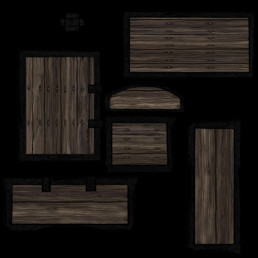
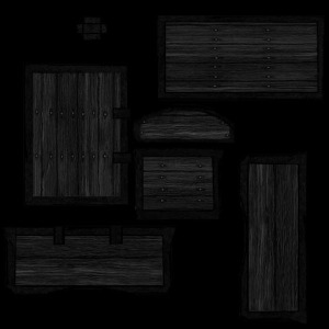
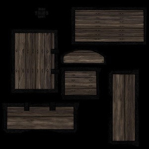
Above is all my maps in their ”Photoshop form”
First is the diffuse texture. The second one is the normal map, and the third and last is the specular map.

Untitled-1 Untitled-2 Untitled-3
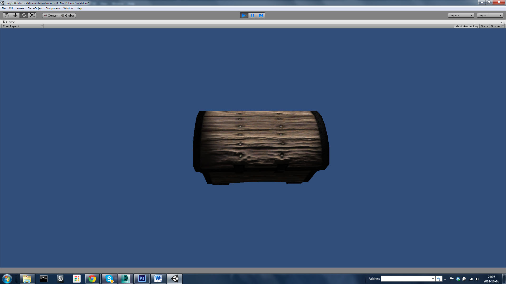
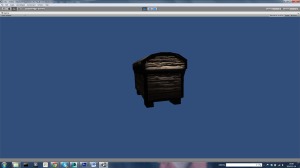
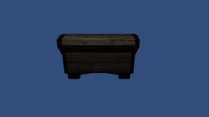
Above is a few screenshots of my chest in it’s final form with a diffuse texture and also a specular and normal map applied to it.

3D Computer Graphics – Blog Post Week 04

This is a blog post that will illustrate some of the thoughts behind the visual style and shed some light on the coloring of my medieval chest that I have been modeling and texturing over the last few weeks. I will also attach some images showing my crate in its final stages, with and without a texture.

At first I wanted to do  the a textured sci-fi crate using a crate I had already created but ultimately I made the decision to go with a medieval theme because honestly, it seemed like much more fun and it’s something I wanted to try for a while now. I believe that anyone can make something look new and polished but to make something look old and withered is something that requires a bit more work and time to accomplish.

The color scheme I went with was several shades of brown to simulate old, unprocessed wood.
I went with black charred metal for the support strips lining the edges of the chest.
The reasoning behind the colors is in fact quite simple. I haven’t worked with this kind of asset before and when I thought of a medieval chest, these were the colors that came to mind.

The dominant color of my chest is a darker shade of brown, I wanted to emulate old wood that maybe hadn’t been properly oiled and finished, I wanted it to look like the wood had a rough look and feel to it, like if you touched it you would get a splinter.

The colors that I used for my chest are warm colors and they are in their full hue, there are however some areas that I chose to brighten in order to give the wood some diversity and to give it a “uneven” look.

Untitled-1

This is how my chest looks when rendered in-engine with only the basic texture applied.
What you see is the mesh and the complete diffuse texture. I have applied basic lighting and aligned the camera in order to get a nice shot of the object.

assignment1_crate1_D
This is the final diffuse texture for my crate as seen in Photoshop, it has all the parts that will be used on the final object. The parts are all painted individually in Photoshop and then applied in 3DS Max using the UV editor. There are some things that I could have done better however, my UV’s were not packed correctly and that is why you there is so much space in between all the different parts.
When dealing with textures it is very important that you make sure that all the pieces are of relevant size and that you pack them tightly.

Untitled-3
This is my final model in wireframe-mode, in 3DS Max.
The wireframe view can be useful when you want to give your model a good look and when you want to go over your final topology.

Untitled-2
This is my final model in 3DS Max with a UV checker applied.
The UV checker is used to check and adjust the sizes of the different parts in your UV editor.

3D Computer Graphics – Blog Post Week 03 – Part 2

This week we were asked to chose a model from a museum in Visby that we were then asked to replicate in 3D using a specific theme as a reference. After a brief tour of the museum and some general background on the items that were on display there we were asked to take photos for later reference, we were also asked to get some information about the object that we ultimately chose.
I chose this knife as my model:

photo 1asdfg4578756

photo 2tuhhdsh

photo 4hhhhhhhhhhh

Untitlehordgfhkgad-1

The reason why I have chosen to model this knife was that I have never gotten around to model one before. I have always wanted to model a knife, and now that I had a chance, I took it. I think that this knife has a very interesting look to it. It has a very comfortable amount of detail to it, perfect for this assignment. I especially like the hilt because i believe it is what gives the knife it’s character.

During the Nordic seven-year war, where Poland, Denmark and Lübeck went to war against Sweden, a danish fleet of Lubeckian ships were headed for Gotland.
This knife is believed to have belonged to a Danish admiral who perished in a devastating storm outside the port of Visby on the night of July 28, 1566. The storm brought down 14 warships and somewhere between 6000 and 8000 men within hours. The dagger itself is made of silver and is used as a sign of honor.

I will try to model this knife as if it could exist in Skyrim i.e. make this as close to the original as possible, there will off course be deviations but i’m going to try at least. I’m also going to try and emphasize the age of the knife, it’s old and i’m going to try and keep it that way. There are inscriptions on the hilt of the knife which i will definitely keep as I think it helps convey the knifes significance and status. Since I’m trying to keep it as close to the original as possible I’m not going to leave any of the detail out.

Some of the things I’m going to try and avoid are making the knife too large or too shiny.
Even though it belonged to a great Danish warrior it doesn’t have to mean that it has to be unnecessarily large or shiny.

One might think that warriors of that specific time and age (1500 – 1550 ) fought with weapons much less sophisticated than the knife I’m going to model. By making it as close as the original as possible, maybe I could prove some of the general misconceptions wrong.

There are always risks with modeling something with a reference, especially when you aim for a result that’s as close to the original as possible. I believe the risks associated with modeling this knife apart from straying too far from it’s original design is the risks you would face in any other modeling process, overlapping faces / vertices, open edges, ngons, multiple edges / vertices and so on.

3D Computer Graphics – Blog Post Week 03 – Part 1

This week we were asked to get into groups and try to optimize each others crates that we had been working on lately. Through the use of 3DS Max’s xView you can locate some of the common problems that can arise when modeling in 3D. Some of the things we have learned to correct are overlapping faces and vertices and how to make sure polygons consisting of more than 4 faces are taken care of.

Since none of my original teammates was present during the model-correctional exercise I was put in a different group that already had 2 models each to correct. That resulted in me taking two of their crates for correction and instead of me writing about what they had done to my crates I was told to write what I did to theirs. In this blog post I will also include a brief description of what I did to improve one of my own crates.

Viktor’s sci-fi crate:

Viktor’s crate was near perfect from the start. It had none of the problems we were taught to look for and aside from removing a very small amount of edges that wasn’t necessary to uphold the structure of the model itself, I couldn’t find anything to improve.

Untitleadsgfhjkhkd-1

Ahmad’s Medieval crate:

First of this model had some problems with overlapping faces. To correct this issue I simply moved the face that was causing this problem a bit to make sure that the edge of the face didn’t overlap with the face right next to it.

Untitlesdafghd-2

My next step with this crate was to fix the overlapping vertices. What I did was to quite simply weld them together.

Untitlesdfghd-3

I also noticed a kind of distortion around the large faces on the side of the crate, it turns out that there were way to many edges there which served no particular function which gave the face a distorted look. The last thing i did with this model was to eliminate all the unnecessary edges and give the thing a thorough clean up.

Untitlessssssddddd-4

My own Sci-fi crate

My model had 1900 triangles, problems with open faces and overlapping vertices.
The first step I took towards cleaning up my model to weld the open faces and correct any edges that became crooked because of the welding. When I had welded open faces together and corrected the overlapping vertices I started removing excess edges. When I had thoroughly cleaned up my model I started adding edges where needed in order to correct ngons.

Untitled-1

And here is the final result.

Untitlefffffffffffffffffffffffffd-1

Next time I model I will take my time and make sure that things are properly attached before moving on. The middle part of my crate was created using a separate object, part of the reason why is that i didn’t have a well thought out plan for what to do with my model and if i had to do it again I imagine the process will be much less complex. Because i didn’t know what i was going for I couldn’t plan ahead as much as I would have wanted to.

3D Computer Graphics: Blog Post Week 2

Theme one:

The theme sci-fi can easily be described as futuristic. When someone says sci-fi I immediately think of star wars. Shiny ships with ion engines and lots and lots of dashboards with blinking light.
Sci-fi basically points to the idea of science and inventions that have not yet been developed.

Image 1: Eve online.

Retribution_Thumbnail

I think this image represents the theme sci-fi pretty accurately. The image depicts a space ship mid-flight. The ship is very high tech and although we have somewhat perfected space travel we are a long way from that type of technology.

Image 2: Halo 4

sci-fi-games-halo-master-chief

This image is of “Master Chief” , a cyberneticaly augmented human with heightened strength and perception. He is wearing a combat armor with built in support for advanced tactical AI’s. Although this technology has been discussed in military circles it has never been achieved and as with the spaceships from Eve Online, the technology is well outside our reach.

My Sci-fi crate.

chest1

chest1-2

For my first theme I choose sci-fi. My reference was mainly a Borderlands 2 “Hyperion chest”.
This chest follows the structure of the aforementioned model as it is wide and long. I imagined it as a chest with two side compartments that will open at the same time as the main compartment. The opening itself will be the two blocks of the main compartment sliding apart but I haven’t gotten around to modeling the inside and animating the opening sequence.

Theme two:  Medieval

The theme medieval doesn’t have to have a detailed introduction.  A medieval chest is basically a chest from the middle ages. When I chose that theme and decided to make a chest using medieval as a visual style I did a quick Google image search with the keywords “medieval” and “chest” and got a myriad of images of chest from that particular point in time.

Image 1: Chivalry

screen1_large

This image depicts a knight, possibly fighting in the holy crusade. One thing that defines “medieval” in this picture is the obvious religious symbols on the knights helmet.

My second chest was supposed to be a medieval chest. I was going for something a little nicer than the ordinary chest. A chest you might want to keep valuable items in. The design is what you would expect from a European-medieval chest, it has a rounded top and stands on 4 legs. Of course I tried not to make the base model to detailed since I think that is best done with texturing.

Untitled-1

chest2

Theme 3:

Post apocalyptic as a theme can be explained as “after the apocalypse” when everything is destroyed, often by a war or something in the likes of that scenario.  Some common sights when playing a post-apocalyptic game is destroyed cars riddled with rust, burnt down houses and debris everywhere.

Image 1: Fallout 3.

fallout3_1_lg

This game serves as an excellent example of post-apocalyptic. The setting is Washington DC and its surrounding areas. Everything is completely destroyed by an atomic war between the United States and the Chinese.

My third theme is post-apocalyptic. Quite frankly I chose this theme because I’ve played a lot of post-apocalyptic games.

My post apocalyptic crate:

Untitled-12

23

For this crate I decided to go for your run of the mill wooden crate. The design is simple since yet again the details is in the textures. If I get around to applying a texture to it, I plan to make the wood look cracked with rusted nails in them, maybe give it a crooked build and basically make it look old and wrecked.

Summary:

I thoroughly enjoyed this exercise as it helped me define what I was creating. Part of me learning how to model in 3D has been to just cerate random shapes and every now and again a house. I’ve recently started working on an ”Iron Man” styled power armor for Batman but this was among the first times I’ve ever opened 3DS max actually knowing what I wanted to create.  It’s hard to actually make an object look like it could fit into the visual styles of pots-apocalyptic or medieval without adding a considerable amount of detail and if you’re not going to texture your model, which is the case with two of them, it’s kind of hard to define the objects characteristics.